

Scatter + Box + Violin
A pet peeve of mine is when papers don’t show the actual data in a figure, when it would have been trivial to include it. Psychology has gotten a bit of a reputation for doing this, but it happens in most fields. Obviously there are times when it isn’t reasonable, or possible, to show all the data. For instance, in Genome Wide Association Studies (GWAS) the main analysis consists of several million comparisons – there’s no way to plot all that data, so instead they plot the p-values (a Manhattan plot), as well as several of the quality-control metrics (like the QQ plot).
Of course, the downside to showing all the data is that it’s harder to make nice figures. In this post I use R to show how to make what I’ve been using as an alternative to the standard bar graph – a scatter box violin plot. As the name suggests, it’s a scatter plot, a box plot, and a violin plot, layered on top of one another. The plot can still look nice, and it has the benefit that it gives the reader a lot of information about the data:
- They can see the actual data that you used in your analysis
- The box plot gives several relevant statistics – the median, 95% confidence interval of the median, the quartiles, and outliers.
- The violin plot gives added information about the distribution and density of the the data, which can be difficult to see in the raw data in some instances
Let’s get some data
First, let’s get some data. I’m using data from a survey on how much school children say they like science. We have data on their sex, which classroom and school they’re from, which state the school is in, and whether the school is public or private. Upon inspection, I realized that they data is very much artificial, so I’m adding some random noise to make it look more realistic.
[EDIT]: I forgot to that the ‘viridisLite’ library is needed as well.
library(DAAG)  library(nlme)  library(ggplot2)  library(ggpubr)
library(viridisLite) scidat<-na.omit(science) scidat$like<-scidat$like+rnorm(n = length(scidat$like),mean = mean(scidat$like), sd = sd(scidat$like))
If you were going to do an analysis, it might look something like this. Here I use a mixed-effect model to account for the fact that the data is clustered by class, school, and state.
fit1<-lme(fixed = like ~ sex + PrivPub , random = ~1|State/school/Class, data = scidat) summary(fit1)## Linear mixed-effects model fit by REML## Data: scidat## AIC BIC logLik## 6566.215 6602.824 -3276.107#### Random effects:## Formula: ~1 | State## (Intercept)## StdDev: 0.0004933071#### Formula: ~1 | school %in% State## (Intercept)## StdDev: 1.616542e-05#### Formula: ~1 | Class %in% school %in% State## (Intercept) Residual## StdDev: 0.5748795 2.53939#### Fixed effects: like ~ sex + PrivPub## Value Std.Error DF t-value p-value## (Intercept) 9.734343 0.1937495 1316 50.24189 0.0000## sexm 0.274763 0.1411918 1316 1.94602 0.0519## PrivPubpublic 0.453471 0.2167979 38 2.09168 0.0432## Correlation:## (Intr) sexm## sexm -0.374## PrivPubpublic -0.774 0.014#### Standardized Within-Group Residuals:## Min Q1 Med Q3 Max## -3.756947309 -0.668405648 -0.006794758 0.679136857 3.014819521#### Number of Observations: 1383## Number of Groups:## State school %in% State## 2 41## Class %in% school %in% State## 66
So we see there’s an effect where children in public schools rate liking science more than their private school counterparts. Now I’ll walk through plotting this data and turning the figure into something you could publish.
Let’s plot some data
First, your basic ggplot box plot. The rating of how much they like science goes on the y-axis, and I’m plotting first by school-type, and then breaking the schools down in to male and female students. NB both the x-variable and the fill-variable (PrivPub & sex) need to be factors for this to work.
ggplot(data = scidat,aes(x = PrivPub, y = like, fill = sex))+geom_boxplot()

This is a fine plot, but we can do better. I’ll use two of my favorite packages to clean it up. ggpubr includes lots of great functions for easily changing plots – here I use it’s default theme to clean-up the plot. The viridis package provides some awesome color scales: they’re pretty (and certainly better than default colors), they’re color-blind friendly, and they’re perceptually uniform (particularly important if you’re using many colors).
ggplot(data = scidat,aes(x = PrivPub, y = like, fill = sex))+geom_boxplot()+scale_fill_viridis_d( option = "D")+theme_pubr()
[EDIT]: If ‘scale_fill_viridis_d’ gives you an error, use:
scale_fill_viridis(discrete=T)

Next I add the violin plot, and I also make some adjustments to make it look better. I add the notch for the box plot, and the outlier-size in the box plot is set to -1 so that we don’t have double-points when the scatter plot is added.
ggplot(data = scidat,aes(x = PrivPub, y = like, fill = sex))+ scale_fill_viridis_d( option = "D")+ geom_violin(alpha=0.25, position = position_dodge(width = .75),size=1,color="black") + geom_boxplot(notch = TRUE, outlier.size = -1, color="black",lwd=1.2, alpha = 0.7)+ theme_pubr()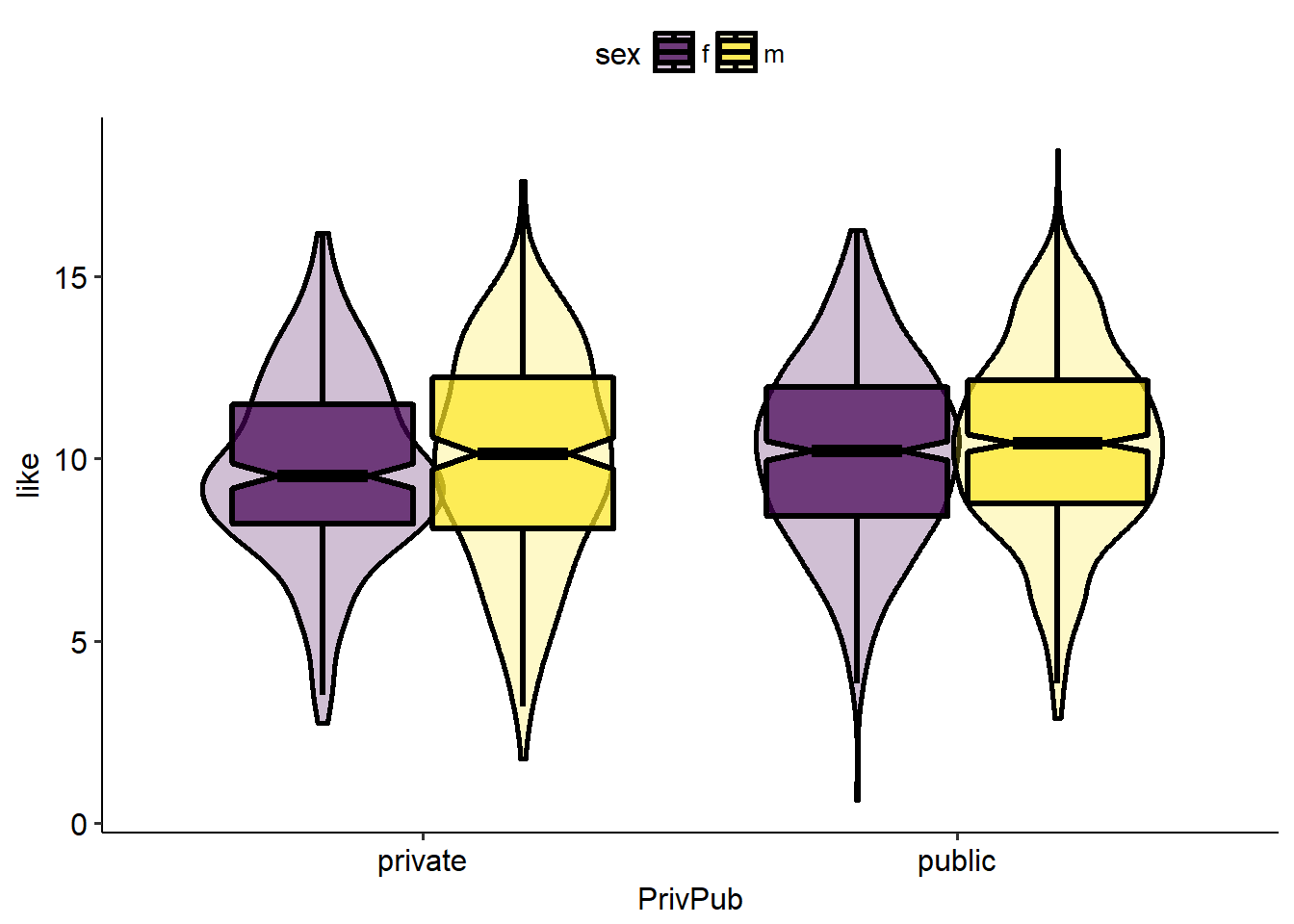
Next the scatter plot is added on top.
ggplot(data = scidat,aes(x = PrivPub, y = like, fill = sex))+ scale_fill_viridis_d( option = "D")+ geom_violin(alpha=0.4, position = position_dodge(width = .75),size=1,color="black") + geom_boxplot(notch = TRUE, outlier.size = -1, color="black",lwd=1.2, alpha = 0.7)+ geom_point( shape = 21,size=2, position = position_jitterdodge(), color="black",alpha=1)+ theme_pubr()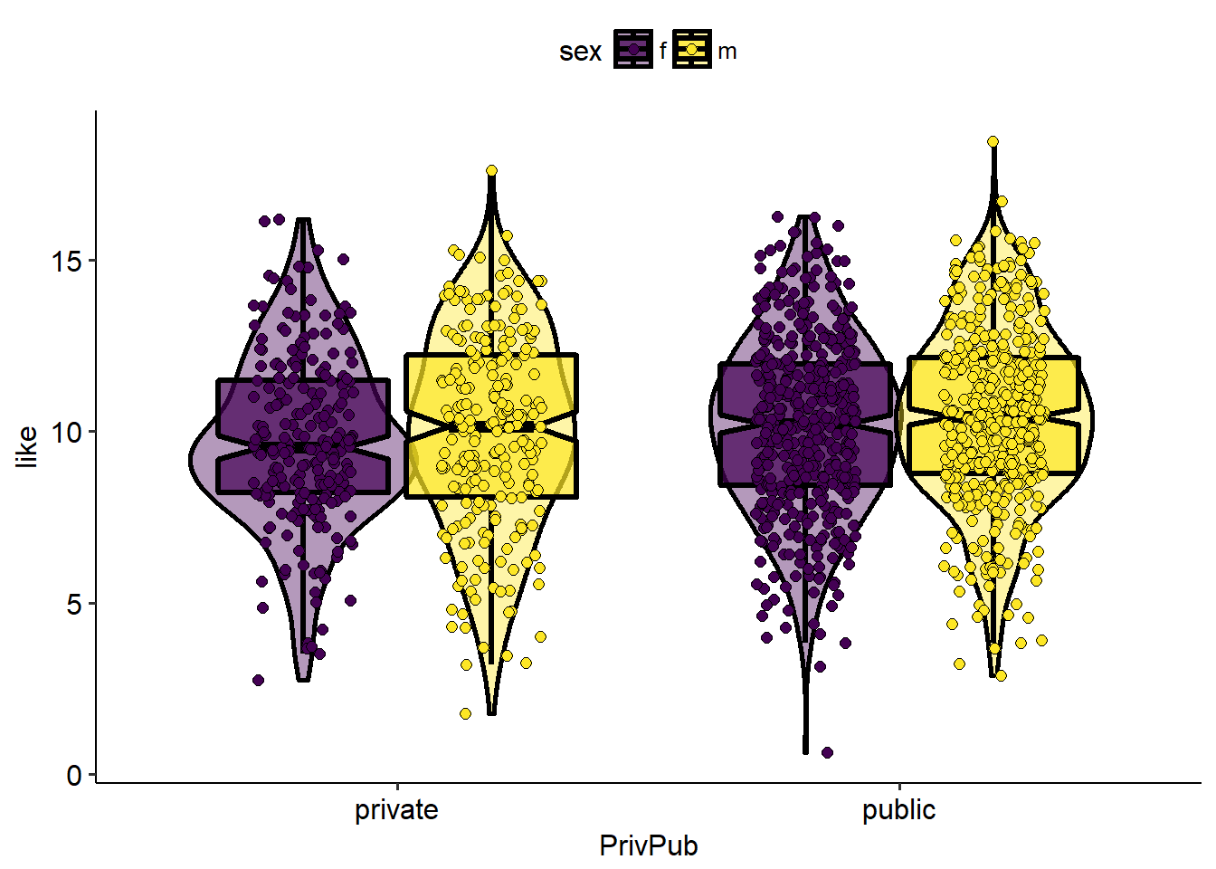
Finally, I make some additional adjustments to make it look nicer. Axis labels are added, the legend title is removed and the legend is moved. I also modify the size of several of the elements, including the font size, and I add a nice black border around the whole thing.
ggplot(data = scidat,aes(x = PrivPub, y = like, fill = sex))+ scale_fill_viridis_d( option = "D")+ geom_violin(alpha=0.4, position = position_dodge(width = .75),size=1,color="black") + geom_boxplot(notch = TRUE, outlier.size = -1, color="black",lwd=1.2, alpha = 0.7)+ geom_point( shape = 21,size=2, position = position_jitterdodge(), color="black",alpha=1)+ theme_pubr()+ ylab( c("How much do they like science?") ) + xlab( c("Type of school") ) + rremove("legend.title")+ theme(panel.border = element_rect(colour = "black", fill=NA, size=2), axis.ticks = element_line(size=2,color="black"), axis.ticks.length=unit(0.2,"cm"), legend.position = c(0.92, 0.85))+ font("xylab",size=15)+ font("xy",size=15)+ font("xy.text", size = 15) + font("legend.text",size = 15)
EDIT: Since posting, this page remains one of the most popular on this site. So here’s an update on how to improve this figure even further.
Let’s add one more package, ‘ggbeeswarm’, and clean things up an bit. ‘ggbeeswarm’ will let us arrange the points more aesthetically, using the ‘geom_quasirandom()’ function. I’ll remove the lines outlining the violin plot, I think that looks better theses days. And we’ll adjust the legend so that only the color corresponding to each group is shown. This is accomplished by removing geom_quasirandom() and geom_boxplot() from the legend using show.legend=F. This leaves only the violin plot in the legend. We adjust the alpha of the legend using the ‘guides()’ call at the end.
library(ggbeeswarm)
 ggplot(data = scidat,aes(x = PrivPub, y = like, fill = sex))+
       scale_fill_viridis_d( option = "D")+
       geom_violin(alpha=0.5, position = position_dodge(width = .75),size=1,color=NA) +
       geom_boxplot(notch = TRUE,  outlier.size = -1, color="black",lwd=1, alpha = 0.7,show.legend = F)+
      # geom_point( shape = 21,size=2, position = position_jitterdodge(), color="black",alpha=1)+
       ggbeeswarm::geom_quasirandom(shape = 21,size=2, dodge.width = .75, color="black",alpha=.5,show.legend = F)+
       theme_minimal()+
       ylab(  c("How much do they like science?")  )  +
       xlab(  c("Type of school")  )  +
       rremove("legend.title")+
       theme(#panel.border = element_rect(colour = "black", fill=NA, size=2),
             axis.line = element_line(colour = "black",size=1),
             axis.ticks = element_line(size=1,color="black"),
             axis.text = element_text(color="black"),
             axis.ticks.length=unit(0.2,"cm"),
             legend.position = c(0.95, 0.85))+
       font("xylab",size=15)+
       font("xy",size=15)+
       font("xy.text", size = 15) +
       font("legend.text",size = 15)+
       guides(fill = guide_legend(override.aes = list(alpha = 1,color="black")))
Fin

what is the x-axis of the scatter plot?
LikeLike
x is a categorical variable – see “x = PrivPub” in the code.
LikeLike
X of the scatterplot is not categorical, it’s continuous. The violin plots use x-axis for private/public categories.
I have the same question as jeremyryoung — I don’t understand what determines the x-position of each dot in the scatterplots. Came across this post while looking for use cases for asymmetrical violin plots.
LikeLike
If you load up the data (install and load the ‘DAAG’ package), you’ll see that the variable ‘PrivPub’ is a factor, taking either the values of ‘private’ or ‘public’. Similarly, ‘sex’ is a factor, taking either the values ‘m’ or ‘f’. The default order for factors is alphabetical, so ‘private’ is plotted to the left of ‘public’, and ‘f’ is plotted to the left of ‘m’. The command ‘factor()’ can be used to reorder the levels of either factor, if you want.
If you’re asking about the specific location of each point along the x-axis, this is controlled by the command ‘position = position_jitterdodge()’. Points are held at the correct y-axis value, and randomly assigned a value along the x-axis (within a restricted range) so that they do not overlap and all points are visible when the plot is viewed.
LikeLike
I thought it might be the dodge() — I’m not that familiar with ggplot so wasn’t sure on a skim. Thanks for the details!
LikeLike
This is a great tutorial, thank you. I am trying to modify the width of the boxplots to make them really narrow, but when I adjust these via width=0.5 (or any other value) the adjustments are asymmetrical. Has anyone else come across this problem?
LikeLike
Thanks! Hmmm, I have not encountered that before. Adding ‘width=.5’ to ‘geom_boxplot()’ works. The position and width of the violin plot and scatterplot would need to be adjusted too, otherwise it looks weird, but I don’t think that’s what you’re talking about here.
#####################
geom_violin(width=.5, position = position_dodge(width = .5))+
geom_boxplot(width=.5) +
ggbeeswarm::geom_quasirandom(dodge.width = .5)
LikeLike