

I work a lot with what is sometimes termed ‘hierarchical’ data. That is, data that is clustered in some way. For me, those clusters are sometimes multiple observations from the same person – as is the case with longitudinal data or within-subject manipulations, or they are multiple observations from a larger unit – such as when participants are related to each other or when data comes from several different study sites. Clustered data can bring lots of advantages, but they also come with hurdles that not everyone is familiar with. Primarily, clustered data violate one of the central assumptions of most standard statistical analyses – that each observation is fully independent of all other observations. In the human literature techniques to appropriately analyze clustered data are now widely used – particularly the mixed effect model, but there are others.
…clustered data violate one of the central assumptions of most standard statistical analyses – that each observation is fully independent of all other observations
Recently, a preprint and associated twitter-thread came out, which described how bootstraps (I’ll get to what this is) can be used to more rigorously analyze hierarchical data. The authors point out that hierarchical data is quite common in molecular/cellular neuroscience, yet there seems to be a lack of awareness of how to appropriately analyze this data – a sentiment I would agree with. For instance, a study might examine many cells that came from only a handful of mice, and not control for which mouse each cell came from. Or each mouse might be tested multiple times over the course of several days, but each test is treated as an independent observation. My goal here is to provide an initial introduction to why you should care about getting this right, and the basics of how to do it.
Why should you care? One approach is to point out that not controlling for clustered data will result in increased false-positives, leading to potentially inaccurate results. This is true, but perhaps threatening researchers with fewer significant results is not the best tactic. Here I’ll consider the alternative – ignoring that your data is clustered could cause you to miss significant effects.
…ignoring that your data is clustered could cause you miss significant effects.
The setup
[I’m going to go through everything first with no code, and the commented code is at the end of this post for those interested in delving deeper]

Here I show some simulated data. There are six mice, and 10 cells were taken from each mouse. Of these cells, half (5) were treated with a drug, and half are controls. The same outcome was then measures in all cells (the outcome has been standardized – z-scored – so the average is 0, and the effect sizes are in standard deviation, also called cohen’s d). In panel A we see that there is some difference between the treatments, but there is also a ton of variability. Running a regression (identical to a t-test in this case) to test if the treatment groups differ, we find a non-significant effect (p>0.05), and the 95% confidence interval (2.5%/97.5%) crosses 0:
                Cohen's D  Std. Error  t value  Pr(>|t|)  2.5 %   97.5 %
Treatment       0.4231     0.2544      1.663    0.102     -0.086  0.932
Looking at panel B though, there’s a lot of variation across mice! Some mice just have a lower outcome than others, regardless of treatment. So how do we adjust for this in our model?
Block permutations
When we calculate the significance of a statistical test, we’re asking how likely it is that we would observe an effect that size or larger, if in fact the true association was zero. The usual way to do this is by making various assumptions about the distribution of variables. With more data (more clusters/mice) we could use a multilevel model, but multilevel models are known to not work well with a small number of clusters (~<10). Another way is by block permutation. In standard permutation, we randomize the variable of interest (our dependent variable – DV, or x variable) several thousand times. By randomizing it we break any relationship between it and the rest of the variables, forcing there to be no association. This generates an ’empirical null’ distribution, which is the range of effects we could expect to see if in fact there was no true effect.
If all our observations are independent, we can randomize freely across all observations. However, if our data are clustered, we have to respect the boundaries of the clusters. One way of thinking about this is to consider that if we randomize freely with clustered data, we’re actually breaking two relationships – the association between our DV and the rest of our variables (which is what we want to do) and the association between our DV and each cluster (which we don’t want).
The solution is what is called ‘block‘ or ‘restricted‘ permutations. Essentially, we identify a subset of all possible permutations that don‘t violate the clustered structure of our data, and only use those permutations. One limitation of this approach is that you need enough blocks of the same size. In this example, all the mice have exactly 10 cells. This could also work if, say, mice had either 8 or 12 cells. But in that case DVs from mice with 8 observations would never be swapped with the DVs from the mice with 12 observations, and vice versa. If all the mice had different numbers of cells, I would have to throw-out some data to make blocks of the same size.
…we identify a subset of all possible permutations that don‘t violate the clustered structure of our data, and only use those permutations.

Using restricted permutations, we get a significant p-value. Out of 100,000 permutations, an effect size larger than 0.42, or smaller than -0.42 (remember, this is a two-sided test), was only observed 884 times. So our p is 884/100,000, or p=0.00884.
Block bootstraps
When we report results, we don’t just report the effect size and p-value, we also report an estimate of how much variability there was in our effect. As we saw in the beginning, we can’t use the standard-error or confidence interval generated from a model that doesn’t account for the clustering of the data – the confidence interval crossed ‘0’.
One solution is to use a method to calculate our confidence interval that is able to accommodate the clustering of the data. Bootstrapping is a way of empirically estimating a confidence interval from your data. The one major assumption is that your data are uniformly drawn from the distribution of all possible values. To bootstrap, you generate a series of synthetic data sets using your actual data, and in each one run the same statistical test. The data sets are created by randomly choosing individual observations to include, and observations can be chosen multiple times, until you have a synthetic data set that is the same size as your original one. Each observation won’t be present each round, and some observations will be present multiple times.
There is a rich literature of modifications to the bootstrap to accommodate clustered data. The intuition here is that we want to respect the data-generating process as much as possible. As with the permutations before, we can’t bootstrap without considering how the data is clustered, and we need to identify bootstraps that respect this clustering.
The intuition here is that we want to respect the data-generating process as much as possible.
There are 6 mice, so we first bootstrap across mice, sampling 6, with replacement (meaning a mouse can be chosen more than once), to use in each simulation. Each mouse has 10 cells, so we’re going to choose 10 observations (again sampled randomly with replacement) from each mouse to include. But, our sample is on the smaller side, so we might further account force it to include half cells that were exposed to the treatment, and half that weren’t (this is sometimes called a constrained bootstrap).
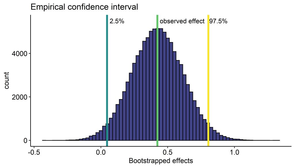
We see with our block bootstrap that the confidence interval is fairly wide, but doesn’t cross ‘0’. Check out this very nice animation if you are unsure what a 95% confidence interval means (hint: it does not mean we have 95% confidence that the true value is within the interval).
Before/After

Bringing it all together, adjusting for the clustering of your data can have some real benefits! Some effects will increase in significance (the opposite, effects becoming less significant, will also happen), and the confidence interval here is smaller. If you use p-values (null hypothesis significance testing) to determine whether there is an effect, this can make a big impact.
There definitely is a learning curve, but these analyses are on the easier side to learn. There are lots of packages in R that help with the heavy lifting too!
The code
# This is R code #

library(simstudy) # simulating data
library(permute) # generating block/restricted permutations
library(lme4) # multilevel models
library(lmerTest) # p-values from multilevel models
library(ggplot2) # data visualization
library(ggpubr) # handy data-viz functions
library(viridisLite) # a good color palette

## First lets simulate some data ##

set.seed(1111) # set the seed of the random number generator

# each mouse is different from every other mouse
# we assume the mice used are drawn from a normal distribution
#  of possible mice. Here I make mice pretty variable

gen.mouse <- defData(varname = "m0",
                     dist = "normal",
                     formula = 0,
                     variance = 4,
                     id = "idMouse")

# We observed 10 cells from each mouse
gen.mouse <- defData(gen.mouse,
                     varname = "nCells",
                     dist = "nonrandom",
                     formula = 10 )

# generate the basic mouse data
dtMouse <- genData(6, gen.mouse)

set.seed(1111)

# each cell is similarly drawn from a normal distribution of
#  possible cells we could have observed
gen.cell <- defDataAdd(varname = "c0",
                       dist = "normal",
                       formula = 0,
                       variance = 2)

# Generate data, cells are clustered within mice
dtCell <- genCluster(dtMouse,
                    "idMouse",
                    numIndsVar = "nCells",
                    level1ID = "idCell")
dtCell <- addColumns(gen.cell, dtCell)

# Cells are randomly assigned to treatment or control group,
#  half of the cells for each mouse are in each greoup
dtCell<-trtAssign(dtCell, n = 2,
                  balanced = TRUE,
                  grpName = "group",
                  strata = c("idMouse"))

set.seed(1111)

# Here the outcome measure is specified.
#  The outcome is defined as varying depending on group
#  that is, there is an effect of group
#  but the strength of the effect varies depending
#  BOTH on the mouse AND the cell

outcome<- defDataAdd( varname = "outcome",
                      dist = "normal",
                      formula = "m0 + c0 + group*.6",
                      variance = 1)

# Add the outcome to our Cell data
dtCell<-addColumns(dtDefs = outcome,dtOld = dtCell)

# Scale the outcome so the effects are in standard units
dtCell$outcome2<-scale(dtCell$outcome,center = T,scale = T)

# what is the effect of group on the outcome?
f1<-lm(outcome2 ~ as.factor(group), data = dtCell)
summary(f1)
confint(f1)

## Generate Figure 1 ##

bymouse<-ggplot(data = dtCell,aes(y = outcome2, x = as.factor(idMouse),color=as.factor(group)  ))+
  scale_color_viridis_d(option = "C",end = 0.75)+
  geom_boxplot()+
  geom_point(position = position_jitterdodge() )+
  theme_pubr()+
  ylab(label = "Outcome")+
  xlab(label = "Mouse ID")+
  labs(color = "Cell treatment group")

bygroup<-ggplot(data = dtCell,aes(y = outcome2, x = as.factor(group),color=as.factor(group)  ))+
  scale_color_viridis_d(option = "C",end = 0.75)+
  geom_boxplot()+
  geom_point(position = position_jitterdodge() )+
  theme_pubr()+
  ylab(label = "Outcome")+
  xlab(label = "Cell treatment group")+
  labs(color = "Cell treatment group")

simdataplot<-ggarrange(bygroup,bymouse,labels = c("A","B"),ncol = 2,
common.legend = T,widths = c(0.5,1))
simdataplot
## Now the block/restricted permutations ##

# First, we identify a set of possible permutations that don't
#  violate our clustered structure
#  Within each mouse our X variable is freely permuted
#  The variables assigned to mice can be completely swapped

perms<-shuffleSet(n = dim(dtCell)[1],nset = 100000,
                  control = how(within = Within(type = "free"),
                                plots = Plots(strata = dtCell$idMouse,
                                                    type = "free") ))

# This is the function that will calculate our
#  empirical null distribution

# for each row in the set of permutations
null_effects<-apply(X = perms,MARGIN = 1,FUN = function(x){
# rearrange the 'group' variable  according to that row
 dtCell$group3<- dtCell$group[t(x)]
# fit a new model with the permuted group variable
  fit_temp<-lm(outcome2 ~ as.factor(group3), data = dtCell)
# save the effect size of the randomized group variable
  return(coefficients(fit_temp)[2])
  }
  )

# calculate the two-sided p-value
pval<-sum((abs(null_effects) > coefficients(f1)[2])*1)/100000
null_effects<-as.data.frame(null_effects)

# Generates figure 2

permplot<-ggplot(data = null_effects,aes(x = null_effects))+
  geom_histogram(binwidth = 0.01,
color="black",
fill=viridis(n = 1,begin = 0.2))+
theme_pubr()+
xlab(label = "Null effects from permutation")+
geom_vline(xintercept = (coefficients(f1)[2]),
           color=viridis(n = 1,begin = .75)  ,size=1.5)+
  labs(title = "Empirical null distribution")+
  annotate("text",label = "observed effect",x=0.25,y=2500)+
  annotate("text",label = paste("p=",pval,sep=""),x=0.3,y=2300)
## Now block bootstraps ##

# reorder the data frame so that treatments are grouped
dtCell <-dtCell[order(dtCell$idMouse,dtCell$group),]
# A new ID to be used later
dtCell$ID <-paste(dtCell$idMouse, rep(c(1:10),6),sep = ".")

# Set the number of bootstraps and pre-allocate the matrix
bootnum<-10000
confinterval<-matrix(0,bootnum,1)

# This is the bootstrap. Runs for 'bootnum' times
for(i in 1:dim(confinterval)[1]){

# resample mice, with replacement
#   expand out 10 times, for each cell
boot1<-rep(sample(c(1:6),size = 6,replace = T),10)

# resample from each treatment group, with replacement, and combine
boot2a<-matrix(sample(c(1:5),size=30,replace = T),6,5)
boot2b<-matrix(sample(c(6:10),size=30,replace = T),6,5)
boot2<-matrix(t(cbind(boot2a,boot2b)),60,1)
boot1<-boot1[order(boot1)]
bootstrapped<-as.data.frame(paste(boot1,boot2,sep="."))
colnames(bootstrapped)<-"ID"

# include only observations that were selected by the bootstrap
bootstrapped<-merge(bootstrapped,dtCell,by="ID",all.x = T)

# run the regression, save the effect size out
bootmodel<-lm(outcome2 ~ as.factor(group2), data = bootstrapped)
confinterval[i,1]<- coefficients(bootmodel)[2]

}

confinterval<-confinterval[order(confinterval),]

confinterval<-as.data.frame(confinterval)

# look-up the confidence interval
confinterval[bootnum*.025,]
confinterval[bootnum*.975,]

# Plot figure 3

confplot<-ggplot(data = confinterval,aes(x =  confinterval))+
  geom_histogram(binwidth = 0.025,color="black",
     fill=viridis(n = 1,begin = 0.2))+
  theme_pubr()+
  xlab(label = "Bootstrapped effects")+
  geom_vline(xintercept = (coefficients(f1)[2]),
       color=viridis(n = 1,begin = .75)  ,size=1.5)+
  geom_vline(xintercept = (confinterval[bootnum*.025,]),
       color=viridis(n = 1,begin = .5)  ,size=1.5)+
  geom_vline(xintercept = (confinterval[bootnum*.975,]),
         color=viridis(n = 1,begin =  1)  ,size=1.5)+
  labs(title = "Empirical confidence interval")+
  annotate("text",label = "observed effect",
          x=(coefficients(f1)[2])+0.185,y=5500)+
  annotate("text",label = "2.5%",
          x=(confinterval[bootnum*.025,])+0.075,y=5500)+
  annotate("text",label = "97.5%",
          x= (confinterval[bootnum*.975,])+0.075,y=5500)
confplot


# Combine data for plot 4

comp<-as.data.frame(rbind(c(unname(coefficients(f1)[2]),
              confint(f1)[2,1],
              confint(f1)[2,2],
              summary(f1)$coefficients[2,4] ),
            c(unname(coefficients(f1)[2]),
              confinterval[bootnum*.025,],
              confinterval[bootnum*.975,],
              pval )
            ))

colnames(comp)<-c("Effect","LLCI","ULCI","pval")
comp$Model<-c("None","Blocked")
comp[,c(1:4)]<-  round(comp[,c(1:4)],digits = 5)
comp$pval<-paste("p = ",comp$pval,sep = "")

# Plot figure 4

comparemodels<-ggplot(comp,aes(x = Model,y = Effect))+
  geom_errorbar(aes(ymin=LLCI, ymax=ULCI), width=.1) +
  geom_point()+theme_pubr()+rotate()+
  geom_hline(yintercept = 0,color = "grey",linetype = "dashed")+
  ylab(label = "Effect size (95% confidence interval)")+
  xlab(label = "Adjustment for\n clustered data\n")+
  geom_label(aes(label = pval),nudge_x = .25,nudge_y = .25,label.size=0)
comparemodels
Bonus!
Congrats on making it to the end 🙂 Astute readers may have noticed that in the case of this particular data set, a mixed-effect model would also perform well. Here’s what that would look like:
# Mixed effect model, controlling for Mouse as a random effect with a random intercept
f2<-lmer(outcome2 ~ as.factor(group2) + (1|idMouse),data = dtCell)
 summary(f2)
## results
Linear mixed model fit by REML. t-tests use Satterthwaite's method ['lmerModLmerTest']
Formula: outcome2 ~ as.factor(group2) + (1 | idMouse)
   Data: dtCell

REML criterion at convergence: 128.8

Scaled residuals:
     Min       1Q   Median       3Q      Max
-3.00013 -0.61054 -0.04761  0.68649  2.24268

Random effects:
 Groups   Name        Variance Std.Dev.
 idMouse  (Intercept) 0.6957   0.8341
 Residual             0.3712   0.6093
Number of obs: 60, groups:  idMouse, 6

Fixed effects:
                                   Estimate Std. Error      df t value Pr(>|t|)
(Intercept)                         -0.2116     0.3582  5.5180  -0.591  0.57816
as.factor(group2)                    0.4231     0.1573 53.0000   2.690  0.00954 **
---
Signif. codes:  0 ‘***’ 0.001 ‘**’ 0.01 ‘*’ 0.05 ‘.’ 0.1 ‘ ’ 1

Correlation of Fixed Effects:
            (Intr)
a.(2)0.9916 -0.220
## compute the confidence interval

confint(f2)[4,]
Computing profile confidence intervals ...
    2.5 %    97.5 %
0.1121534 0.7340946

# How big is the effect of Mouse ID?
library(rptR)
rpt(outcome ~ as.factor(group2) + (1|idMouse),grname = "idMouse",datatype = "Gaussian",nboot = 0,npermut = 0,data = dtCell)


Repeatability estimation using the lmm method

Repeatability for idMouse
R  = 0.652
SE =  NA
CI = [NA, NA]
P  = 1.36e-10 [LRT]
     NA [Permutation]
In the case of the mixed-effect model, the p-value is quite similar to the one we got with permutations (p = 0.0095 vs p = 0.0088) and the confidence interval is also quite similar (0.112 – 0.734 vs 0.046 – 0.804 ). We also see that there is quite a large effect of Mouse ID in this data set (mouse ID explains 65% of the variance after controlling for treatment group).

[…] [This was originally posted on my blog] […]
LikeLike